25 Best Company ID Card Templates
If you have come to this page, it means you understand the importance and need for an ID card in any organization, big or small. An organization will need its employees to have ID cards for identification purposes, mainly. If you have reached this site for the same purpose, do not hesitate to scroll down and find any card that suits your preferences.
The descriptions will help you make up your mind. Once you have made your choice, click on the download option, and the template is all yours. Enjoy your search.
Sample Editable Templates
#1
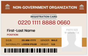
You are looking at the first card on our list. This card is for company employees. This is very simple yet eye-catching at the same time. The light brown color, which is prominent, gives it a very decent look, but a significant glimpse of blue at the bottom steals the show. The company logo will be placed at the top of the card, and to its right, a photo of an employee of the company will be posted or printed, and right below that is the space for the address and contact details of the company. This card also has a long strip of barcode between orange and blue.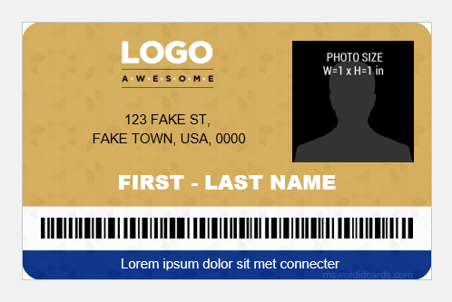
#2
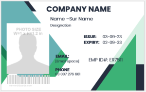
The second card on our list is a very interesting one. It is a tetra-color card; white is the most prominent color here, which is right in the middle of the card. A very interesting combination of maroon and navy blue strips at the top and bottom of it is making it mesmerizing. The fourth color is black, which is used as the base color for the 1.2″ x 1.5’’ picture. This card has more details than the first card, such as the department name at the top and the left-bottom card serial number. To the right of the picture box, there is some space for the logo of the company.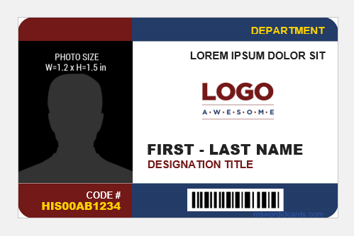
#3
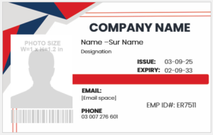
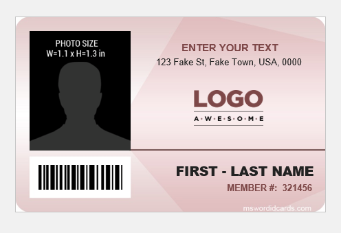
Pink is the main color of this card. The shade of pink that is used in this card is very adorable yet decent. An angular pattern is prominent in the background. The picture box for employee identification is at the left of the card; below that is a barcode. At the top right, there is space for the address of the company, while a logo will be positioned just below it. The bottom of the card is dedicated to the name and employment number of the employee. This card only holds important information on it, which makes it so uncomplicated.
#4
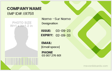
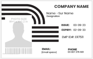
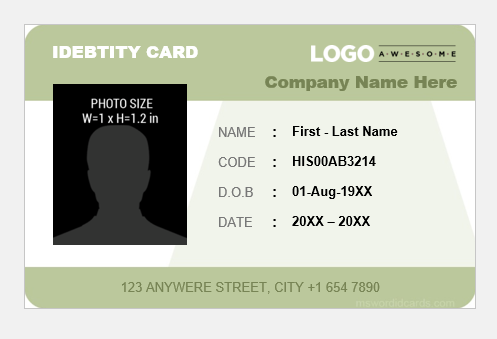
This card comprises a combo of two colors, white and green. The white color is in the middle and has two light green stripes at the top and bottom. This color combination has its grace, and because of this color scheme, the card gives a pleasant impression of the company. The company logo, along with its name, appears on the top green strip. The photo space for the cardholder is on the left, and to its right comes the name of the employee, his code number, the cardholder’s date of birth, and the duration of the validity of the card. At the bottom of the green strip, the company address will be mentioned.
#5
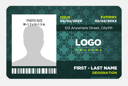
This bright and bold card is best for a company that is not afraid of such bold impressions. The color used as the background is very decent, and its double shades make it even cooler. The picture of the user of this card is of special importance here, as a picture of size 1.2″ x 1.6 needs to be placed on the left side. On the right side, the logo is the first element that comes on top, while all the other information falls just below it. Other information includes the first and last name, designation, date of birth, date of issuance, and code.
#6
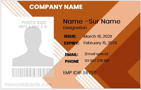
This is another piece of art that we have chosen for you. The designer has played with the dark and light tones of brown here beautifully. The upper strip is dedicated to the first and last name of the employee, along with his designation and the date of issuance and expiration of the card. The second lighter strip holds the address of the company, while a square barcode is placed right in the middle. A small picture will be placed on the right side, and the date of birth and ID of the employee will come just below the barcode.

#7
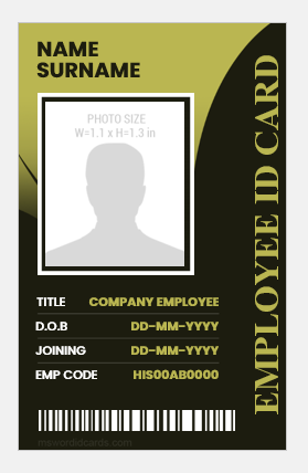
A big picture on the left, a logo in the middle, the issue and expiration date on top, and the name and designation of the employee at the bottom conclude this card. No extra detail was mentioned, and no fancy colors were used in the background. Still, the card looks the best among the lot. The olive green color has given this card such grace that no other color could. If you feel the same way, download this template for free and carry it with your name and picture on it.
#8
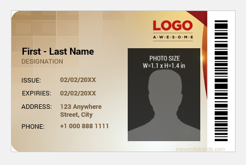
This card is the best example of an old-school-designed one. Different shades of brown are used here skillfully. The background of the details of the employee is very light, so the details above are visible but illegible. The upper right corner of this card has a dark shade, which gives it a spark. The logo of the company will be placed above the 1.1″ x 1.4″ picture of the employee on the right. A wide strip of white color is left on the extreme right side, which carries the barcode on it. Download it for free now if you like this card.
← Previous Article
50 Best Office ID Card TemplatesNext Article →
30+ Best Medical Staff ID Card Templates